Why Responsive Web Design Matters More Than Ever
Think about the devices you use every day. You might read the news on your smartphone during breakfast, browse shopping websites on your laptop while working, and watch videos on your tablet in the evening. Although you're using different devices, you expect every website to look clean, load quickly, and remain easy to use.
Modern websites are designed to provide exactly that experience. Instead of creating separate versions for desktop and mobile users, developers build websites that automatically adjust their layout according to the visitor's screen size. This approach is known as Responsive Web Design (RWD).
Responsive Web Design has become one of the most important principles of modern web development. Today, a large percentage of internet users access websites from smartphones and tablets rather than desktop computers. If a website is difficult to read, requires constant zooming, or forces visitors to scroll horizontally, many users simply leave and visit another website.
For this reason, businesses, educational platforms, blogs, online stores, and government websites all prioritize responsive design. It helps deliver a consistent browsing experience regardless of the device being used.
In this guide, you'll learn what Responsive Web Design is, how it works, why it's essential for modern websites, and the techniques developers use to create layouts that automatically adapt to different screen sizes.
What Is Responsive Web Design?
Responsive Web Design is a web development approach that allows a website to automatically adjust its layout, images, navigation, and content based on the size of the visitor's screen.
Instead of creating separate desktop and mobile websites, developers build a single flexible website that responds intelligently to different devices. Whether someone visits using a smartphone, tablet, laptop, or large desktop monitor, the same website reorganizes itself to provide a comfortable reading and browsing experience.
The content usually remains the same, but the way it is displayed changes according to the available screen space.
A Simple Example Everyone Can Understand
Imagine reading a newspaper.
When it's fully opened on a large table, you can comfortably read multiple columns at once.
Now imagine folding that same newspaper several times until it becomes much narrower.
The information hasn't changed, but the way you read it has.
Responsive websites behave in a similar way.
- Large desktop screens may display four cards in one row.
- Tablets may display two cards per row.
- Smartphones usually display one card at a time.
Nothing is removed. The website simply reorganizes its layout to fit the available space more efficiently.
Why Responsive Design Became Necessary
Years ago, most people accessed websites using desktop computers with similar screen sizes. Developers could create webpages with fixed layouts because they knew approximately how visitors would view them.
Today, internet users browse websites using thousands of different devices.
- Smartphones
- Tablets
- Laptops
- Desktop computers
- Large monitors
- Smart TVs
Each device has a different screen size and resolution.
If websites continued using fixed layouts, many pages would become difficult to use on smaller screens. Visitors would constantly zoom, scroll sideways, and struggle to tap buttons.
Responsive Web Design solves these problems by automatically adapting every page to fit the visitor's device.
Why Responsive Web Design Is Important
Responsive design improves far more than appearance. It directly affects usability, accessibility, visitor satisfaction, and long-term website performance.
When people can easily navigate a website without zooming or struggling to read text, they're more likely to stay longer and explore additional pages.
For businesses, this often leads to higher engagement, more enquiries, increased sales, and stronger customer trust.
Educational websites also benefit because students can comfortably read articles from any device without formatting problems.
Benefits of Responsive Web Design
- Creates a consistent experience across all devices.
- Improves readability on smaller screens.
- Reduces maintenance by using a single website instead of separate desktop and mobile versions.
- Makes navigation easier for visitors.
- Supports faster website updates.
- Improves accessibility for a wider audience.
- Builds a more professional appearance.
- Encourages visitors to spend more time exploring the website.
Responsive Design and Search Engines
Responsive design isn't only beneficial for visitors. It also supports better website performance in search engines.
Modern search engines aim to recommend websites that provide a positive user experience across different devices. Mobile-friendly websites are generally easier to navigate, easier to read, and less frustrating for visitors.
Although responsive design alone doesn't guarantee higher rankings, it contributes to several factors that influence search visibility, including usability, page experience, and accessibility.
If you'd like to understand how search engines discover and evaluate websites, continue with our guide on How Search Engines Work: A Beginner's Guide to Google Search .
Responsive Design Is Part of Frontend Development
Creating responsive websites is one of the primary responsibilities of frontend developers.
They use HTML to build page structures, CSS to control layouts and styling, and JavaScript to create interactive features that work smoothly across different screen sizes.
Responsive design has become a standard skill for frontend developers because modern users expect websites to function equally well on every device.
If you're new to web development, our guide on Frontend vs Backend Development: What's the Difference? explains how frontend developers build everything visitors see while backend developers manage the systems working behind the scenes.
One Website for Every Device
One of the biggest advantages of Responsive Web Design is simplicity.
Instead of maintaining separate websites for desktop and mobile visitors, developers can build one flexible website that automatically adapts to different screens.
This approach saves time, reduces maintenance, improves consistency, and makes future updates much easier because changes only need to be made once.
In the next section, we'll explore exactly how responsive websites work using flexible layouts, CSS Grid, Flexbox, media queries, responsive images, and modern frontend techniques that power today's websites.
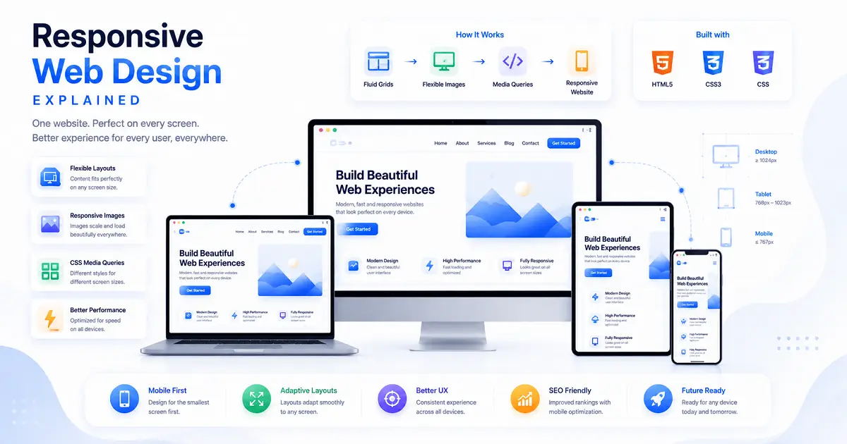
How Responsive Web Design Works
Responsive Web Design isn't created by accident. Behind every modern website are several technologies working together to ensure the layout automatically adjusts to different screen sizes.
Instead of creating separate versions of a website for desktop and mobile users, developers build one flexible layout that responds intelligently whenever the available screen size changes.
When someone opens the same webpage on a desktop computer, tablet, or smartphone, the browser automatically applies different layout rules without changing the actual content.
This flexibility is achieved through modern frontend technologies such as flexible layouts, responsive images, CSS media queries, Flexbox, and CSS Grid.
Flexible Layouts
One of the biggest differences between older websites and modern responsive websites is the way layouts are created.
Earlier websites often used fixed-width layouts. Developers assigned an exact width to every section, meaning pages looked acceptable on only one screen size.
Modern responsive websites use flexible layouts instead.
Rather than assigning fixed pixel widths, developers use percentages, relative units, and flexible containers that automatically expand or shrink according to the available screen space.
As the browser window becomes wider or narrower, every section adjusts smoothly without breaking the page structure.
Images are another important part of responsive design.
Large desktop images often become too wide for smaller devices if they aren't resized correctly. This may force users to scroll horizontally or wait longer while oversized images load.
Responsive images automatically resize themselves according to the available screen width while maintaining their original proportions.
This provides several advantages.
- Images remain sharp on different devices.
- Pages load faster.
- No horizontal scrolling occurs.
- The website maintains a professional appearance.
CSS Media Queries
One of the most powerful features behind Responsive Web Design is the CSS Media Query.
Media Queries allow developers to apply different CSS rules depending on the visitor's screen size.
For example, a desktop navigation menu may display several menu items in a single horizontal row.
When viewed on a smartphone, the same menu can automatically transform into a hamburger menu without changing the website itself.
The browser simply detects the available screen width and applies different styling rules.
Flexbox Makes Layouts More Flexible
Flexbox is a modern CSS layout system designed to arrange elements efficiently inside a webpage.
Instead of manually positioning every item, developers define how elements should grow, shrink, align, and wrap according to the available space.
This makes Flexbox especially useful for:
- Navigation bars
- Button groups
- Cards
- Feature sections
- Pricing tables
- Profile layouts
As screen sizes change, Flexbox automatically reorganizes these elements while maintaining consistent spacing and alignment.
CSS Grid Creates Powerful Page Layouts
While Flexbox works extremely well for arranging items in one direction, CSS Grid is designed for building complete page layouts.
Grid allows developers to divide a webpage into rows and columns, making it much easier to organize complex designs.
For example, an online shopping website might display:
- Five products per row on a desktop.
- Three products per row on a laptop.
- Two products per row on a tablet.
- One product per row on a smartphone.
All of these adjustments happen automatically without creating separate webpages.
Responsive Navigation Menus
Navigation menus are one of the most noticeable changes on responsive websites.
Large desktop screens usually have enough space to display every navigation link across the top of the page.
On smartphones, however, displaying every menu item in one row would make the navigation difficult to use.
Responsive websites solve this problem by replacing the full navigation bar with a compact hamburger menu.
When users tap the menu icon, the navigation expands vertically, making it much easier to browse on smaller screens.
Typography Also Adapts
Responsive design isn't limited to layouts and images.
Text also adjusts according to screen size.
Large desktop headings may become slightly smaller on mobile devices, while paragraph spacing and line height are optimized to improve readability.
This ensures visitors can comfortably read articles without constantly zooming in or scrolling sideways.
Buttons and Forms Become Easier to Use
Touchscreen devices require larger interactive elements than desktop computers.
Responsive websites automatically increase button sizes, form fields, and clickable areas on smaller devices, making them easier to tap accurately with a finger.
These adjustments significantly improve usability, especially for visitors using smartphones.
Responsive Design Improves Website Performance
A well-designed responsive website not only looks better but also performs more efficiently.
Optimized layouts, properly sized images, and modern CSS techniques help reduce unnecessary loading time while creating a smoother browsing experience.
Fast-loading websites generally encourage visitors to stay longer and explore additional pages, which contributes to better overall user satisfaction.
If you're interested in learning how websites are stored online before visitors access them, our guide on What Is Web Hosting? Everything Beginners Need to Know explains how hosting servers deliver website files across the internet.
Responsive Design Is Built Into Modern Web Development
Today, responsive design is no longer considered an optional feature.
Whether you're building a personal portfolio, business website, educational platform, online store, or blog, visitors expect every page to work smoothly across different devices.
For frontend developers, responsive design has become a fundamental skill because modern websites must provide a consistent experience regardless of screen size.
In the next section, we'll explore mobile-first design, breakpoints, real-world examples, common beginner mistakes, and the best practices developers follow when creating responsive websites.
What Is Mobile-First Design?
One of the biggest changes in modern web development is the adoption of the mobile-first approach. Instead of designing websites for desktop computers first, many developers now begin with the smallest screens and gradually expand the layout for tablets, laptops, and desktop monitors.
This approach reflects the way people use the internet today. For many websites, mobile visitors now make up a significant portion of total traffic. Designing for smaller screens first encourages developers to focus on essential content, simple navigation, and faster performance.
Once the mobile version works well, additional space available on larger screens can be used to introduce extra sections, multiple columns, larger images, and enhanced layouts without affecting usability.
Understanding Breakpoints
Responsive websites don't create a completely different layout for every individual device. Instead, developers define specific screen widths called breakpoints.
When the browser reaches one of these breakpoints, the website automatically adjusts its layout to provide a better viewing experience.
For example, a website may display a single-column layout on smartphones, switch to two columns on tablets, and expand to four columns on desktop monitors.
These transitions happen automatically without requiring visitors to reload the webpage.
How Different Devices Display the Same Website
| Device | Typical Layout |
|---|---|
| Smartphone | Single-column layout with stacked sections |
| Tablet | Two-column layout with larger images |
| Laptop | Three-column layout with wider content areas |
| Desktop Monitor | Multi-column layout with full navigation |
Although the appearance changes, visitors continue accessing the same website and the same content. Only the layout adapts according to the available screen space.
Real-World Examples of Responsive Design
Responsive Web Design is used across almost every type of modern website.
News websites reorganize articles to improve readability on smaller screens.
Online stores automatically adjust product grids so shoppers can browse comfortably on mobile devices.
Educational websites resize lessons, quizzes, and learning dashboards to fit tablets and smartphones.
Business websites simplify navigation and display important contact information more prominently on smaller devices.
Regardless of the industry, responsive design helps visitors access information comfortably from any device.
Best Practices for Responsive Web Design
Professional frontend developers follow several proven practices when creating responsive websites.
- Start with a mobile-first layout.
- Use flexible CSS Grid and Flexbox layouts.
- Optimize images before uploading them.
- Keep navigation simple and easy to access.
- Use readable font sizes on every device.
- Create buttons that are comfortable to tap.
- Reduce unnecessary animations.
- Test websites on multiple screen sizes regularly.
- Maintain consistent spacing throughout the design.
- Prioritize fast loading performance.
Following these practices helps developers create websites that remain usable even as new devices and screen sizes continue appearing.
Common Mistakes Beginners Should Avoid
Many beginners understand the theory of responsive design but make practical mistakes while building their first websites.
Using Fixed Widths Everywhere
Fixed-width layouts often appear acceptable on desktop computers but become difficult to use on smaller screens.
Flexible layouts provide a much better long-term solution because they automatically adapt to different devices.
Ignoring Mobile Testing
Some developers only test websites on their own computer.
A layout that looks perfect on a large monitor may contain navigation problems, oversized images, or unreadable text on smartphones.
Testing across multiple devices helps identify these issues before publishing.
Making Buttons Too Small
Desktop users interact with a mouse, while mobile users rely on their fingers.
Buttons that are easy to click with a mouse may become frustrating to tap accurately on touchscreens.
Uploading Large Images
Oversized images increase loading times and consume unnecessary mobile data.
Optimizing images before publishing improves both website performance and visitor experience.
Ignoring Readability
Even a visually attractive website becomes difficult to use if visitors must zoom in to read paragraphs or struggle with tightly packed text.
Comfortable spacing, readable font sizes, and clear headings improve accessibility for every visitor.
Responsive Design and Modern Web Development
Responsive Web Design is no longer a separate feature added after a website is finished.
Today, it is considered a core part of frontend development. Modern websites are planned with responsiveness in mind from the very beginning, allowing every section to adapt naturally as screen sizes change.
Developers combine HTML, CSS, JavaScript, Flexbox, CSS Grid, responsive images, and media queries to build layouts that work consistently across every device.
Building Responsive Websites Requires Multiple Skills
Responsive design is closely connected with several other areas of web development.
Before creating responsive layouts, developers first build the website structure using HTML and CSS. They then use frontend development techniques to make the interface interactive, while backend systems handle data processing and business logic.
Once the website is complete, it must be published through reliable hosting so visitors can access it online.
If you're continuing your learning journey, our guides on Domain Names and Web Hosting explain how websites become available on the internet after development is complete.
Why Responsive Design Will Continue to Matter
New devices continue appearing every year, from foldable phones and tablets to ultra-wide monitors and smart displays.
Because screen sizes will always vary, responsive design will remain an essential part of modern web development.
Developers who understand responsive design create websites that remain useful, accessible, and visually appealing regardless of how technology evolves.
In the final section, we'll answer frequently asked questions, recommend related articles, summarize the key concepts covered in this guide, and explain why Responsive Web Design has become one of the most valuable skills for every frontend developer.
Frequently Asked Questions
1. What is Responsive Web Design?
Responsive Web Design (RWD) is a web development approach that allows a single website to automatically adjust its layout, images, navigation, and content according to the visitor's screen size. This ensures the website remains easy to use on smartphones, tablets, laptops, and desktop computers without creating separate versions for each device.
2. Why is Responsive Web Design important?
People access websites using many different devices every day. Responsive design provides a consistent browsing experience across all screen sizes, improves usability, increases visitor satisfaction, and reduces the need to maintain multiple versions of the same website.
3. Does Responsive Web Design help SEO?
Responsive design supports SEO by improving the overall user experience. Mobile-friendly websites are easier to navigate, load efficiently, and provide better accessibility, all of which contribute to a stronger browsing experience for visitors. Although responsive design alone doesn't guarantee higher rankings, it supports many factors that search engines consider important.
4. What technologies are used to build responsive websites?
Modern responsive websites are primarily built using HTML, CSS, JavaScript, CSS Flexbox, CSS Grid, Media Queries, and responsive images. Together, these technologies allow webpages to adapt automatically to different screen sizes while maintaining a consistent user experience.
5. What is Mobile-First Design?
Mobile-First Design is a development approach where developers design websites for smartphones first and then gradually enhance the layout for tablets, laptops, and desktop computers. This approach helps prioritize essential content and ensures websites perform well on smaller devices before expanding to larger screens.
6. What are CSS Media Queries?
CSS Media Queries allow developers to apply different styles based on screen width, device type, or display characteristics. They make it possible for layouts, navigation menus, typography, and spacing to change automatically depending on the visitor's device.
7. Do I need separate desktop and mobile websites?
No. One of the biggest advantages of Responsive Web Design is that a single website can automatically adapt to multiple screen sizes. This simplifies maintenance, reduces development effort, and provides a consistent experience across all devices.
8. What should I learn after Responsive Web Design?
Once you're comfortable with responsive design, continue learning about APIs, web hosting, domain names, frontend development, backend development, JavaScript frameworks, and programming languages. Together, these topics provide a complete understanding of modern web development.
Related Articles
Continue exploring web development with these beginner-friendly guides that explain the technologies used to build and publish modern websites.
- Web Development Basics for Beginners
- What Is an API and How Does It Work?
- How Search Engines Work: A Beginner's Guide to Google Search
- What Is Web Hosting? Everything Beginners Need to Know
- What Is a Domain Name and How Does It Work?
- Frontend vs Backend Development: What's the Difference?
- Best Programming Languages to Learn in 2026
Final Thoughts
Responsive Web Design has become an essential part of modern website development because people no longer browse the internet using a single type of device. Visitors expect websites to work smoothly whether they're using a smartphone, tablet, laptop, or desktop computer. A responsive website meets those expectations by automatically adjusting its layout without changing the content itself.
Creating responsive websites involves much more than resizing images or rearranging a few sections. Developers combine flexible layouts, responsive images, CSS Grid, Flexbox, Media Queries, and mobile-first design principles to ensure every visitor enjoys a comfortable browsing experience regardless of screen size.
For beginners, learning Responsive Web Design is one of the most valuable investments you can make. It strengthens your frontend development skills, improves the quality of your projects, and prepares you to build websites that meet modern industry standards. Nearly every professional website created today relies on responsive design as a fundamental requirement rather than an optional feature.
As technology continues to evolve and new devices appear, responsive design will remain one of the most important skills in web development. Understanding how to build flexible, accessible, and user-friendly websites will help you create projects that remain useful for years to come.
Keep practicing by building real websites, testing them on different devices, and improving your layouts with every project. The more experience you gain, the more natural responsive design will become, helping you create websites that look professional and perform well across every screen.
🚀 Continue Your Typing Journey
Ready to improve your typing speed and accuracy? Practice daily with our Typing Practice page and measure your progress through our Typing Tests.
Continue Learning with TypeNest
Responsive web design is no longer optional—it's an essential part of modern website development. As more people browse the internet using smartphones, tablets, and different screen sizes, building responsive websites has become a fundamental skill for every web developer.
Continue learning the technologies behind responsive websites, strengthen your frontend development skills, and practice building layouts that provide an excellent user experience on every device.
Last Updated: July 2026
Author: TypeNest Editorial Team
🚀 Build Better Websites with TypeNest
Discover beginner-friendly guides on responsive design, web development, programming, APIs, hosting, and other essential technologies to create modern, mobile-friendly websites with confidence.
Welcome Back
Login to continue your typing journey.